*This is a guest blog post by Jaap Geraerts. Jaap works as part of the team that won the DM2E Open Humanities Award at the Center for Editing Lives and Letters.*
[In the previous update](https://dm2e.eu/open-humanities-awards-joined-up-early-modern-diplomacy-update-4/) we touched upon the relationship between the data and the software used for creating visualizations and this blog expands on this topic, for it is becoming increasingly apparent that -‘modern’- research techniques such as visualizations and network analysis have their own pitfalls. [In a perceptive blog post](http://www.scottbot.net/HIAL/?p=39600), Scott Weingart raises the question when the use of networks is and is not appropriate, and he rightfully states that network structures can be deceitful, partly because the algorithms used in network software are based on specific assumptions. Moreover, the data used for a network analysis can be biased or skewed, obscuring relationships between people or over-emphasizing the centrality of a person within a network. Networks also contain only so much information: the network structure of the data-set of our ‘Joined Up Early Modern Diplomacy project’, for instance, consists of the links between people that are solely based on their correspondence, leaving out the whole range of other relationships derived from family ties, friendships, et cetera. The relationship between Robert Cecil and William Cecil, for example, did not merely consist of the two letters the latter (father William) sent to the former (his son Robert). To give another example from the Bodley data-set: Anthony and Francis Bacon individually corresponded with Bodley, yet outside this epistolary network these brothers shared at least one link (kinship). This points at the existence of various networks of which people were part and the different positions people had in these networks (i.e. even though a certain person may have been a central figure in an epistolary network, this does not mean that he is in the centre of other networks in which he operated). For example, whereas person A is central in an epistolary network (he corresponded with B and C, two people who did not write to each other), in the social network of these three people, person B was central (having met person A once, and person C very often – B and C were cousins – while A and C never met). As such, network structures and visualizations of networks only show a part of ‘reality’, as networks are, naturally, dependent on the data with which they have been created.
Another difficulty when aiming to produce visualizations based on historical data can be the lack of context or points of reference for the viewers. Consider the following visualization, for instance:
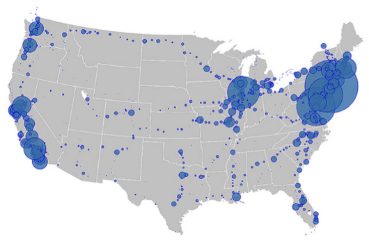
Even without knowing what these blue dots mean, the viewer instantly recognizes that this image tells us something about the United States of America. The image, which shows the number of people who board or alight a flight (and where), can be explained very easily. Even though much is left unexplained in this image, the fact that the context is rather obvious and the fact that the data easily can be used to show density, makes this an effective visualization. However, in other cases the density of a network structure and the often resulting [hairballs](http://www.vpascual.org/blog/wp-content/uploads/2012/06/Screen-Shot-2012-06-17-at-20.16.02-.png), unintelligible clutters of nodes and edges, are more confusing than explanatory. When aiming, for instance, to include another layer of data into an epistolary network (such as the people mentioned in the letters), the result can become something like this:
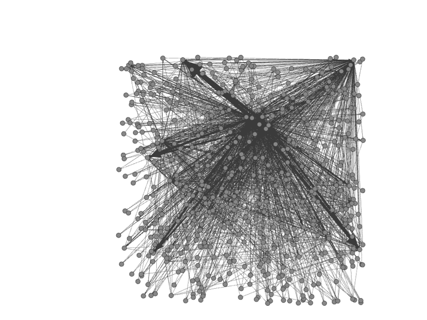
This is an extreme example as the visualization has not been modified by using algorithms and filters, but it exemplifies how easily visualizations can become meaningless when using substantial layers of data in combination with the lack of a clear context. It therefore behoves the scholar to consider the particularities of the data and its possible limits as well as the aim of the visualization before enthusiastically pouring the data into computer programs. Furthermore, how to integrate the visualizations with the scholarship that underlies the visualization? And how do the visualizations tie in with the aims of the research and in what way do they enrich this research?
Possible ways of dealing with complex data can be to use different types of visualizations which show aspects or parts of the data set, perhaps to elucidate an aspect of the dataset which is otherwise difficult to perceive. Another option is to focus on a specific part of a larger visualization, or to approach the data from a specific angle (e.g. how did topic X flow through an epistolary network) in order to highlight the specifics of the network. Although countless options are imaginable, incorporating various visualizations into a narrative structure is a potential way of dealing with a complex data set, as the text can provide the much-needed (historical) context while also explaining the limits of the visualization to the reader. This does not mean that each visualization is accompanied by a lengthy explanation, but rather that the text and the visualizations support each other so that visualizations are not merely an addition to a story, but become part of it.
The point is that complex data can be visualized, but often at the cost of losing some of the complexity which makes the data (or sources) so interesting to study in the first place. When standing on their own, modern research techniques such as visualizations do not always add significantly to the existing scholarship: the crux is to combine these innovative techniques with more ‘traditional’ scholarship and to integrate the methodologies that are used for the gathering and mining of archival data in order to be able to push the boundaries of the research undertaken in the fields in which we are working.
Comments are closed.